Data Viz Feature: Twenty Years from 30,000 Foot
November 24 2020
Network monitoring firm Highlight turns a mass of chaotic traffic and performance information into neat, colourful one-page panoramic views so non-technical clients can spot potential problems at a glance, and discuss them with suppliers. CEO & founder Richard Thomas started by reading design guru Ed Tufte twenty years ago - and the charts haven't stopped evolving ever since. Here he talks to MrWeb's Nick Thomas.

What Highlight Measures and Why
The idea came out of running a small consultancy co in the 1990s, helping mostly large companies around London set up networks. A lot of people were building them at great expense and connecting their IT together, and didn't have a clue who was using them, whether they were behaving, or overloaded, failing, causing problems. There were some software tools around that would let you investigate that but they were all written by engineers for engineers. The technical tools would go into the network, suck up all the info they could and then slap it on the screen in front of you. It was your job to pick out the bits you want; and then if it told you the packet loss on your 2MB Internet connection is .01%, it was your job to know whether that's good or bad.
The opportunity was for some software which collects information from the network but presents it in a way that just about anyone can understand.
NT: what were you monitoring in those days and how has that changed / expanded?
RT: It started off as Internet connections we monitored - they were quite flaky at the time and very expensive... The first big Internet monitoring customer was in 2000; that spread into LANs and for a while the connectivity was getting quite reliable, maybe 10 years ago, and people were worrying less about it - then along came 2 things, broadband and Wi-Fi. Broadband meant much cheaper LAN and everyone went piling into it without realising there was a reason it was much cheaper - it wasn't a private road any more, and it was built on tech which is likely to fail a lot more, so there was a new need to monitor what was going on. Likewise internally, Ethernet-based LANs which don't really break became wi-fi, because of the whole mobile thing - mobiles don't do Ethernet - and wi-fi is flaky.
Tufte and First Principles
RT: Twenty years ago or so, I came across a series of books on the visual display of quantitative info, by a guy called Ed Tufte, an expert and a professor - a guru in the display of information. He runs through his ideas in a very, very clear way and I thought 'I can use some of these'.
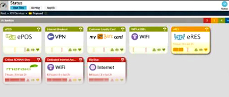
Highlight's Heat Tiles - for how they've evolved, see the Data Viz supplement.
One of my key aims is to keep things as simple as possible - I've never liked complication. I'm a huge advocate of getting everything on one page - in fact our first reports were on paper, not on the web! - so on one sheet or on one screen. The key thing to me is for your brain to assimilate everything: you don't want to scroll down or turn over, you want to be able to see the whole thing. If you want to navigate away from that then you mustn't lose the context of the original picture, because what you want to do is see a summary and then drill down into it. If there's a little spot of red there and you say 'What's that? Give me a little bit more detail', you need to do that without losing the original context, somehow keep the original screen visible, so that the drill-down comes up almost as an overlay on top of it, but you can still see the original. If the drill-down completely replaces the original and then you drill down again, you've become now obsessed with the detail, and lost the context.
Tufte also talks about 'small multiples'. If your brain looks at a picture, the first thing it has to work out is what the structure is. If it's a graph, what's the graph showing me - time along here, capacity along here, and I've got a line here and if the line's along the top of the graph that's good, and if it's falling down towards the bottom it's a problem. What you shouldn't do is continually show people different types of graph that they have to understand separately: take the same graph but small versions of it - maybe a grid of 16 graphs, each showing a different aspect of the same thing, or the same aspect of 16 different things. Your brain is incredibly good at spotting patterns and picking anomalies out of patterns, so if you show people data as a pattern that they can recognise they get very comfortable with that and their brain immediately switches out of understanding what's going on, to extracting info from it.
That's been a really good lesson. We have what we call heat tiles, say with an oil company with a bunch of petrol stations, we summarise each station into a little tile which can be really quite small, and you can get a lot of them on the screen, but you're essentially showing the same tile with the same information / metrics, and the user can very quickly scan across them and look for patterns, or spot things that are bad.
NT: Do you have a lot of movement in what you're displaying? Real-time updates as you watch?
RT: No, our typical interval for collecting stuff is every 3 minutes, you can do it every 30 seconds and some people do, but there it gets too noisy...
NT: ...you start to notice things that actually *aren't* significant?
RT: Exactly that, you notice little short spikes - if the traffic on your network goes berserk for 10 seconds, it doesn't *really* matter, it's just someone downloading a large file, and it's going to saturate the network, but if it goes crazy for 3 or 5 minutes that's an issue. So 3 minutes is our default. You get some people who say almost as a sales ploy 'How fast can you go, because we want to tell our customers how real-time it is, that we can respond incredibly quickly'. So one customer does it every 30 seconds, but you also get false positives - if you're monitoring things very, very frequently and something stops working for 3 seconds, does it matter? Probably not.
We Like Traffic Lights
NT: Is it mostly because of the use of colour, that you can spot the vital info / see the patterns?

RT: Colour helps enormously, because it adds another dimension - with a graph you can very quickly show the shape of something, is it getting worse or better, is it changing rapidly or is it steady: what colour allows you to do with no change in the shape is to add whether that's bad or good, so you can actually start interpreting it. You can give people a grid of - If you like - 200 or 300 tiny little graphs or little tiles, and you can scan across them to see a pattern quite easily, but to look for anomalies / highlight things, colour is incredibly effective - your brain is very good at using colour.
NT: You use a traffic light-type system...
RT: One of the other rules is that if you use primary colours, saturated colours, with the progression blue-green-yellow-orange-red, showing you the health of something, that's a good-to-bad progression. If it's more of a soft or pastel colour then it's drawing your attention to something, it's not a graduation or a scale, it's a 'Look Here' or just 'This is Different from that'. For example if a network has gone into an off-line state deliberately so it's not something to worry about. We use the same set of colours in a standard way across the product, so if anything is red you know you have to pay attention to it.
Every customer logs into a single URL, and it takes them to whatever they're concerned with - they'll see their context, depending on what they wanted us to monitor in there. There are different layouts but all with enough commonality that they'll be able to switch between them easily enough. So for some live examples, we might be monitoring the wi-fi that a major oil firm has at all its petrol stations in Europe, that would show you a certain set of metrics like the number of users attached to the network, eg there might be 5 people using it in that petrol station, or in a Pret a Manger you've got 26 people in that coffee shop accessing it. In another type you might be looking at a set of broadband connections and a different type of information - eg how many times have they auto-adjusted the bandwidth on the circuit this month - because that's a sign that it's not so stable or that it's got some connection problems. Across those two and lots of other examples the colours will all be consistent, and the basic shapes of the graphs will be from 4 or 5 different fundamental types of graphic that we use.
Sharing Information
RT: Transparency is very important to us... one of our main selling points is 'This is info we should share with your customer' - it's designed so you as a service provider and your customer can see the same info so you can talk about it. So if you ask me when I've got my business head on What Does Your Company Do?, I'll say 'We help service providers have better conversations with their customers' - because ultimately that's what we're trying to do, that's why they should buy Highlight. The real benefit of the graphics and all the data is so that people can have a conversation about what's going on.
Navigation & Transitions
RT: We've changed how we do transitions in the last couple of years. We used to do it with pop-ups, you'd see something and you'd say 'I want to drill down into it', so you click on it and a window opens up with more info in. That turns out to be really hard for mobile devices - they don't have pop-up windows because they have much smaller screens, and you've then got limitations in space, so the trend we're switching to is sliding panels: you've got a menu down your left and you click on some info in the content, and a panel slides in from the right, visually sliding in, called a transition. Then you can either put that away by closing it or swiping it to the right; or you can click on something in that panel, and something else slides in from the right, so you've got this drilling down through several layers and you can see the context, a left and tight context so it's intuitive, starting with the original menu and then what's just visible from the first swipe and what's from the second and so on - each layer doesn't quite overwrite the one before it. On a mobile you know you'll only have one layer of drag-in because you just run out of space.
NT: I suppose for us oldies as well it's quite like paper, you have something there on your desk and you need to refer to something else and you put it on top of that to look, and the first one is there to look at when you've finished with it, it's like a To Do pile.

RT: With advances in graphic processing, you don't simply switch to a new view, you transition to it: you show an animation that lets people see where the new thing has come from, you don't simply go Bonk and show the new one over the top of it - so again it's like this paper analogy, I can just see the old one peeping out from under the new one. Something is minimised, like a thumbnail, and then when you click on it this thing grows into the middle of the screen, then goes away again, and in your head your brain kind of stores where that's come from and that it's tied to this thing down there, and it's an intuitive thing.
NT: Presumably everything you do has for a long, long time been designed for desktop. Any pressure on you to make it look more like consumer products that people are used to on their mobiles - and how does the small screen affect your design generally?
RT: Less than a lot of people, because most people manage their network from a desk. Launching a mobile app version is certainly much lower priority than evolving the desktop version in other ways. We've talked about doing a much cut-down app that would just give you a real-time picture, so if you're out shopping or something there'll be a network alert that comes through on a mobile, a little ping - you can do that now, ask Highlight to send me an email if you get a problem in this area or that area, but we can make that a little friendlier, so there's a vibration in your pocket, and you can tap that to show a summarised version of the problem.
Browser technology has only in the last few years made it much easier to transition things nicely - they are increasingly expected to replace, expand and collapse different parts of the screen rather than people scrolling around. JavaScript and libraries have become much, much better for transitions so you don't have to code that sort of thing yourself. You can say to the browser 'When you display this just do a nice little gentle cross-fade into this, slide this new content in from here'. How you get info onto the screen is in some ways as important as what you're displaying itself.
For the full article, see Oct' 2020 Data Visualization Supplement - Page 78
For illustrations and discussion of how the design of Highlight's 'Heat Tiles' has evolved and the thinking behind it, see Oct' 2020 Data Visualization Supplement - Page 82
Biography:
Richard is a lifelong geek and technology enthusiast who founded Highlight 20 years ago on the back of a small consultancy practice. He lives in Surrey, has been married for 37 years, and has two children who've both turned out pretty well and know much more than their father in their respective fields (machine intelligence and skippering large yachts, which just goes to show how different kids from the same family can be). He likes cats, really good coffee, and buying and restoring vintage machine tools because they're a great low-tech antidote against spending too much time in IT. And Yes, he's Nick Thomas' brother.
www.highlight.net
Other 21 YEARS / Data Visualization content now available (read and download the
full supplement here):
A Dream Team to Fight Budget Cuts? - Great visuals and wide-ranging automation are a powerful combination for market researchers looking to justify budgets in the Covid era, says Confirmit Chief Product Officer Torbjörn (Tobi) Andersson.
All Change at Toluna - Paul Twite, Toluna's MD EMEA and LatAm, looking at the company's recent big announcements - rebranding and the launch of Toluna Start.
Tip of the Iceberg Ipsos.Digital CEO Andrei Postoaca backs AI to unlock its full potential behind the scenes within ten years, allowing business needs to return to centre stage.
Faster, Better, More - Debbie Senior, Toluna's VP Product Automation, looks at the 'need for speed', and other factors driving changes in the way we process, share and display data.
21 Years Feature: Medallia LivingLens CEO Carl Wong - Continuing our focus on Data Visualization, the LivingLens co-founder talks in-depth with MrWeb's Nick Thomas.
Beauty, Clarity or Both? - Joe Parker, Brand Director of London-based Motif puts an insight professional's spin on one of the longest-running debates in design.
MrWeb 21 Years Feature: Board Builder - Medallia's Senior Director of Product Management Vache Moroyan and his team are tasked with building dashboards that are a pleasure for research professionals to work with.
Didier Truchot on Finding Clarity in 2020 - Ipsos co-founder & CEO Didier Truchot talks about clients' need for clarity, AI's potential to change our industry, and why insight professionals should be confident about the future.
MrWeb 21 Years Feature: Data Viz and DIY Research - Ipsos.Digital CEO Andrei Postoaca talks about the challenges involved in developing a DIY research platform for one of the world's biggest and best known insight groups.
All articles 2006-23 written and edited by Mel Crowther and/or Nick Thomas, 2024- by Nick Thomas, unless otherwise stated.


 RT: With advances in graphic processing, you don't simply switch to a new view, you transition to it: you show an animation that lets people see where the new thing has come from, you don't simply go Bonk and show the new one over the top of it - so again it's like this paper analogy, I can just see the old one peeping out from under the new one. Something is minimised, like a thumbnail, and then when you click on it this thing grows into the middle of the screen, then goes away again, and in your head your brain kind of stores where that's come from and that it's tied to this thing down there, and it's an intuitive thing.
